Unity GKL - Verdant Falls v2 - Testrun 4-17-23
4-17-23
Rounding out the second testing run, Verdant Falls is showing both problems and promise. A carry-over from a rushed week of hurried projects and medical examinations, Verdant Falls still suffers from being too short to be considered a complete level. While I was already aware that visuals come last, when I created the prefabs for this level, I was not expecting my schedule to be absolutely wrecked as it was. As such, I've now learned my lesson and will make sure that any attempt at visuals come last. This is not news to me, I've dealt with this in the past, but my desires to make a shiny product before a feature-complete and well-tested product has been a very bad habit of late.
Despite my awareness of this habit, I still find it hard to shake, hindering the quality of my levels. Before this course in level design, I had worked in Valve's Hammer Editor making multiplayer levels for Team Fortress 2. Here, visuals almost always took a backseat to good level design. This philosophy was reinforced by the tools provided and the aesthetic of testing levels. Using grid-like orange and white textures, the basic geometry of your map would be laid out in very clear terms, perfect for testing and refining. If anything, what I believe has me thinking backwards now is Unity's default materials. Being flat colors without any frame of reference makes the scale very hard to keep consistent. On top of this, the flat-colored shapes are just jarring to look at, so I often try incorporating models and/or prefabs to help me scale the level to the player.
Unfortunately, I scaled this recent level way too small, leading to an insanely short level. Of my 5 play tests, all 5 said they enjoyed the aesthetics of the level, with some noting that the scale is pleasantly consistent. Though despite this, our goal here is not to make a level that is pure eye-candy. First and foremost, levels need to be fun and engaging, and to engage the player, you need to keep them playing for at least a minimum amount of time. Though this valuable time is not a concrete value set in stone, most all level designers would probably agree that under 3 minutes is way too short for even an introductory level. When I compromised on the level by reworking the completed area, I had assumed that by packing all the necessary content into a brief and comprehensive package would suffice for a somewhat decent level, I was hardly prepared for how empty and incomplete the playtests felt with my level. Players enjoyed the look and feel, but were left wanting much more, with some saying it's "half a level", which isn't too far from the truth unfortunately.
Either way, life struggles are not a solid excuse for an incomplete product. Although this month has been my personal hell, certain strides need to be made for my levels to feel complete and polished again. My next iteration, exploration, or otherwise will see to it that the length is substantial while avoiding a cheap feeling.
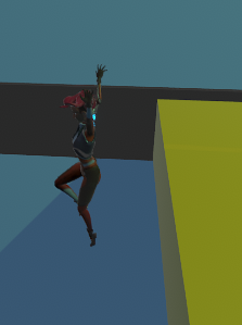
Besides this, there were a few other issues plaguing the level. Firstly, the jump physics in Game Kit Lite are very exploitable. Using the smallest of footholds and unusually steep angles, some players were able to jump over the entire level with ease. When I first made the level, I added barriers to the outside edges to prevent falling into the void, but seeing how easily the platforming can be exploited, I would definitely want to add even more invisible boundaries in the next iteration. Among the detractions was the moving platform. Before export, the platform worked perfectly, carrying the player to the destination, but once I reimported on my laptop, the platform no longer brought the player along for the ride. Another issue on importing was that the checkpoint I set did not carry over, leading to one tester having to restart the level after getting stuck in some acid.
Nonetheless, the path to a better level is clear and achievable. Thank
you for following along with this turbulent adventure!


Comments
Post a Comment